material-ui의 DataGrid에 button을 추가하는 법

Table의 경우
Material-ui의 Table의 경우는, 아래와 같이. map 할 때 그냥 TableCell의 content로 button을 적으면 된다.
import React from 'react';
import { makeStyles } from '@material-ui/core/styles';
import Table from '@material-ui/core/Table';
import TableBody from '@material-ui/core/TableBody';
import TableCell from '@material-ui/core/TableCell';
import TableContainer from '@material-ui/core/TableContainer';
import TableHead from '@material-ui/core/TableHead';
import TableRow from '@material-ui/core/TableRow';
import Paper from '@material-ui/core/Paper';
const useStyles = makeStyles({
table: {
minWidth: 650,
},
});
function createData(name, calories, fat, carbs, protein) {
return { name, calories, fat, carbs, protein };
}
const rows = [
createData('Frozen yoghurt', 159, 6.0, 24, 4.0),
createData('Ice cream sandwich', 237, 9.0, 37, 4.3),
createData('Eclair', 262, 16.0, 24, 6.0),
createData('Cupcake', 305, 3.7, 67, 4.3),
createData('Gingerbread', 356, 16.0, 49, 3.9),
];
export default function BasicTable() {
const classes = useStyles();
return (
<TableContainer component={Paper}>
<Table className={classes.table} aria-label="simple table">
<TableHead>
<TableRow>
<TableCell>Dessert (100g serving)</TableCell>
<TableCell align="right">Calories</TableCell>
<TableCell align="right">Fat (g)</TableCell>
<TableCell align="right">Carbs (g)</TableCell>
<TableCell align="right">Protein (g)</TableCell>
<TableCell align="right">Button</TableCell>
</TableRow>
</TableHead>
<TableBody>
{rows.map((row) => (
<TableRow key={row.name}>
<TableCell component="th" scope="row">
{row.name}
</TableCell>
<TableCell align="right">{row.calories}</TableCell>
<TableCell align="right">{row.fat}</TableCell>
<TableCell align="right">{row.carbs}</TableCell>
<TableCell align="right">{row.protein}</TableCell>
<TableCell align="right"><button>I am button</button></TableCell>
</TableRow>
))}
</TableBody>
</Table>
</TableContainer>
);
}
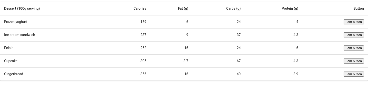
아래는 위 코드의 실행 스크린샷이다.
TableCell에 적은 대로 각 row 마다 "I am button"이 잘 출력된다.
DataGrid
근데 material-ui의 DataGrid는 특별하다.
Column을 정의할 때, 그 배열에서 원하는 column이 오는 순서의 object의
renderCell이라는 key에 button을 생성하는 화살표 함수를 지정하면 된다.
import * as React from 'react';
import Button from '@material-ui/core/Button';
import { DataGrid } from '@material-ui/data-grid';

const columns = [
  {
    field: 'date',
    headerName: 'Year',
    width: 150,
    renderCell: (params) => (
      <strong>
        {params.value.getFullYear()}
        <Button
          variant="contained"
          color="primary"
          size="small"
          style={{ marginLeft: 16 }}
        >
          Open
        </Button>
      </strong>
    ),
  },
];

const rows = [
  {
    id: 1,
    date: new Date(1979, 0, 1),
  },
  {
    id: 2,
    date: new Date(1984, 1, 1),
  },
  {
    id: 3,
    date: new Date(1992, 2, 1),
  },
];

export default function RenderCellGrid() {
  return (
    <div style={{ height: 300, width: '100%' }}>
      <DataGrid rows={rows} columns={columns} />
    </div>
  );
}
아래는 실행결과 스크린샷이다.
정상적으로 button들이 rendering 되었다.
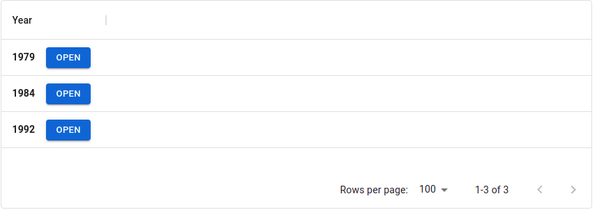
저 rendercell이 불리면서 button이 rendering 되어 각 row마다 button 이 추가되는 것이다.
약간 valudate랑 사용법이 비슷하다.
둘 다 해당 column의 cotent를 채우기 위해 화살표 함수를 사용하여 새로운 content를 만든다.
포스팅하며 느낀 점
요즘 react를 자주 만지니 기분이 좋다.
기분만 좋지 말고 실력 좋은 사람이 될 수 있게 노력하자.
기능 구현은 어느 정도 할 줄 아는 것 같으니, test나 css 쪽 스타일을 보자.
다른 사람이 구현한 코드도 많이 보자.
참고한 사이트 :
React Table component - Material-UI
Tables display sets of data. They can be fully customized.
material-ui.com
Data Grid - Rendering - Material-UI
The grid is highly customizable. Take advantage of a React-first implementation.
material-ui.com
'개발 > react' 카테고리의 다른 글
| props vs. state 2 (그리고 this) (0) | 2021.03.27 |
|---|---|
| Props vs. State (0) | 2021.03.25 |
| React와 React Hooks의 상태와 생명주기 (0) | 2021.03.23 |
| React 전역 상태(state) 관리 라이브러리 Recoil (0) | 2021.03.21 |
| 리액트 컴포넌트 안 바뀜(react component not change) (0) | 2021.03.04 |


댓글